Trinil icons
An open-source icon system built for clarity, versatility, and visual neutrality — over 500 icons drawn by hand, and counting.

539
Icons designed to date
15
Icon categories already structured
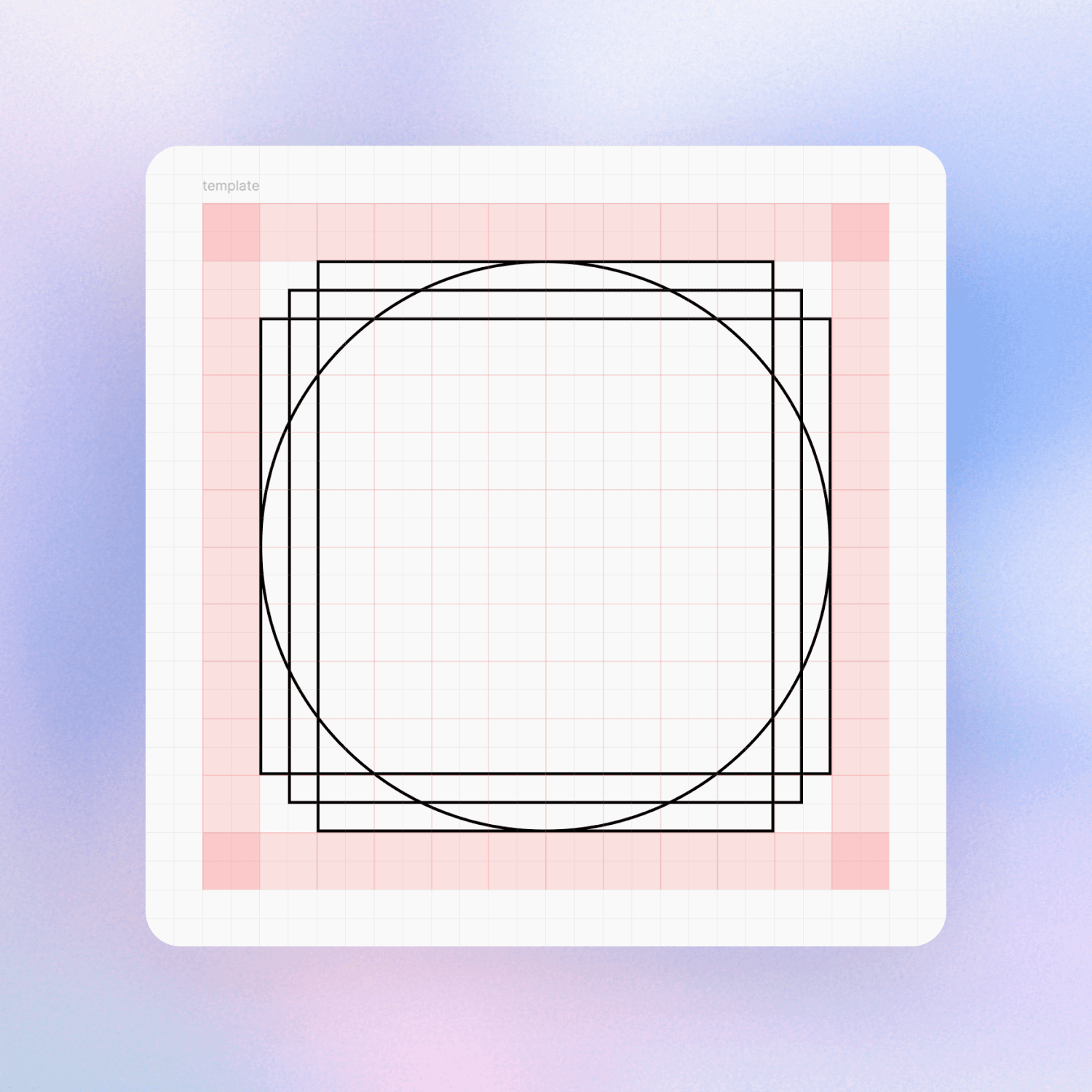
24×24px
Grid system for pixel-perfect consistency
1.5px
Stroke weight, optimized for clarity and accessibility
Introduction
Trinil Icons is a personal project that grew into something bigger. What began as a creative exercise turned into the foundation of a full-fledged open-source icon system. Built entirely from scratch in Figma, Trinil was born out of a desire to contribute to the design community with a set of icons that are both practical and quietly distinctive.
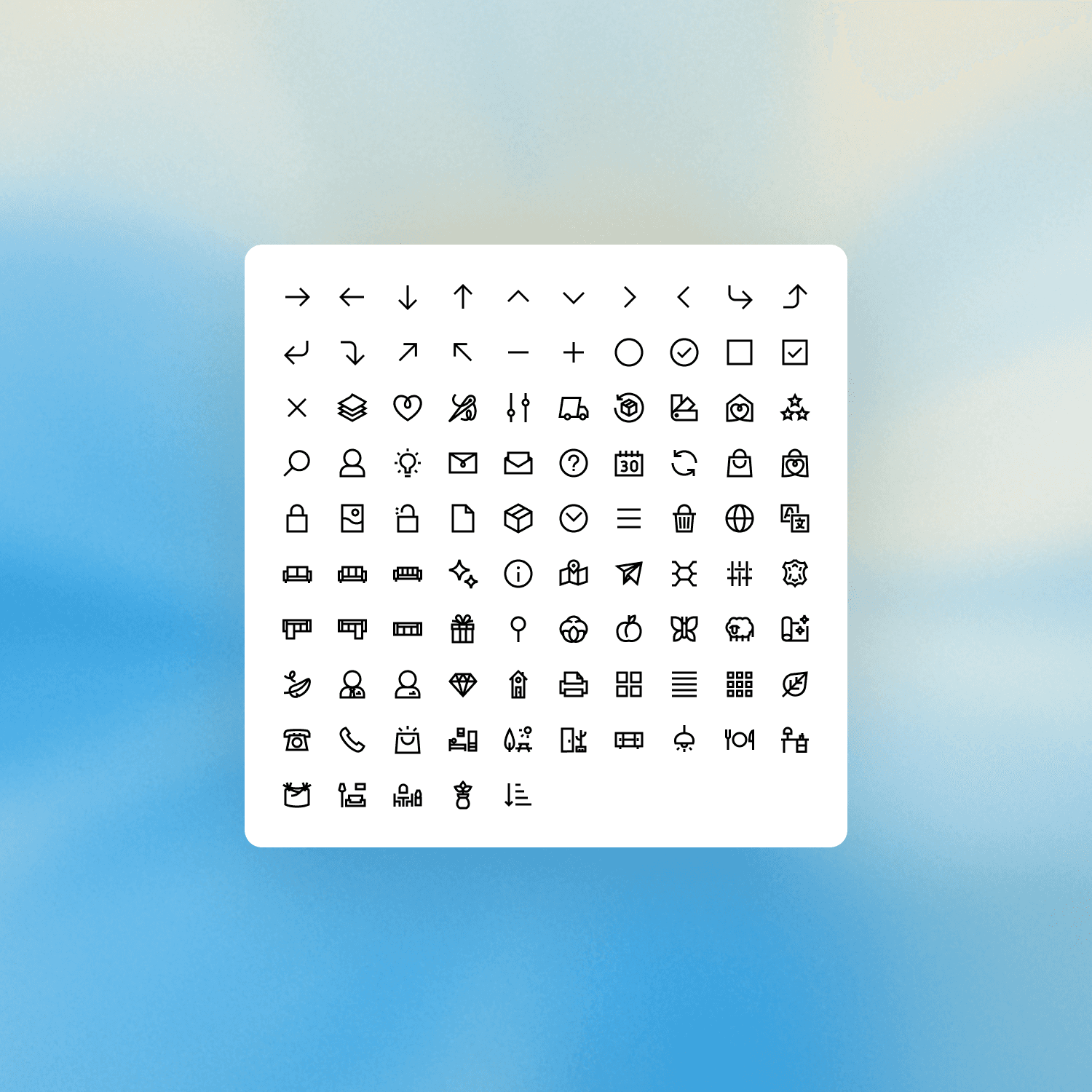
The project now includes over 500 icons, spanning a wide range of use cases, and will eventually grow beyond 1,000. Designed for digital products, interfaces, and documentation, Trinil focuses on consistency, clarity, and ease of use — with a tone that stays out of the way.
A style built for function, not for show
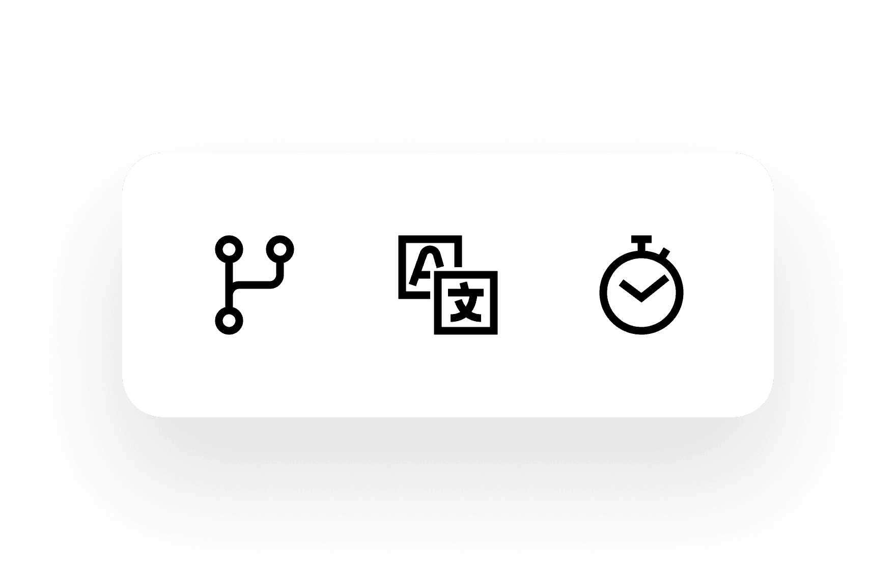
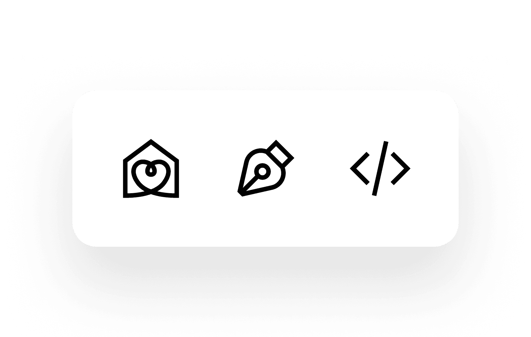
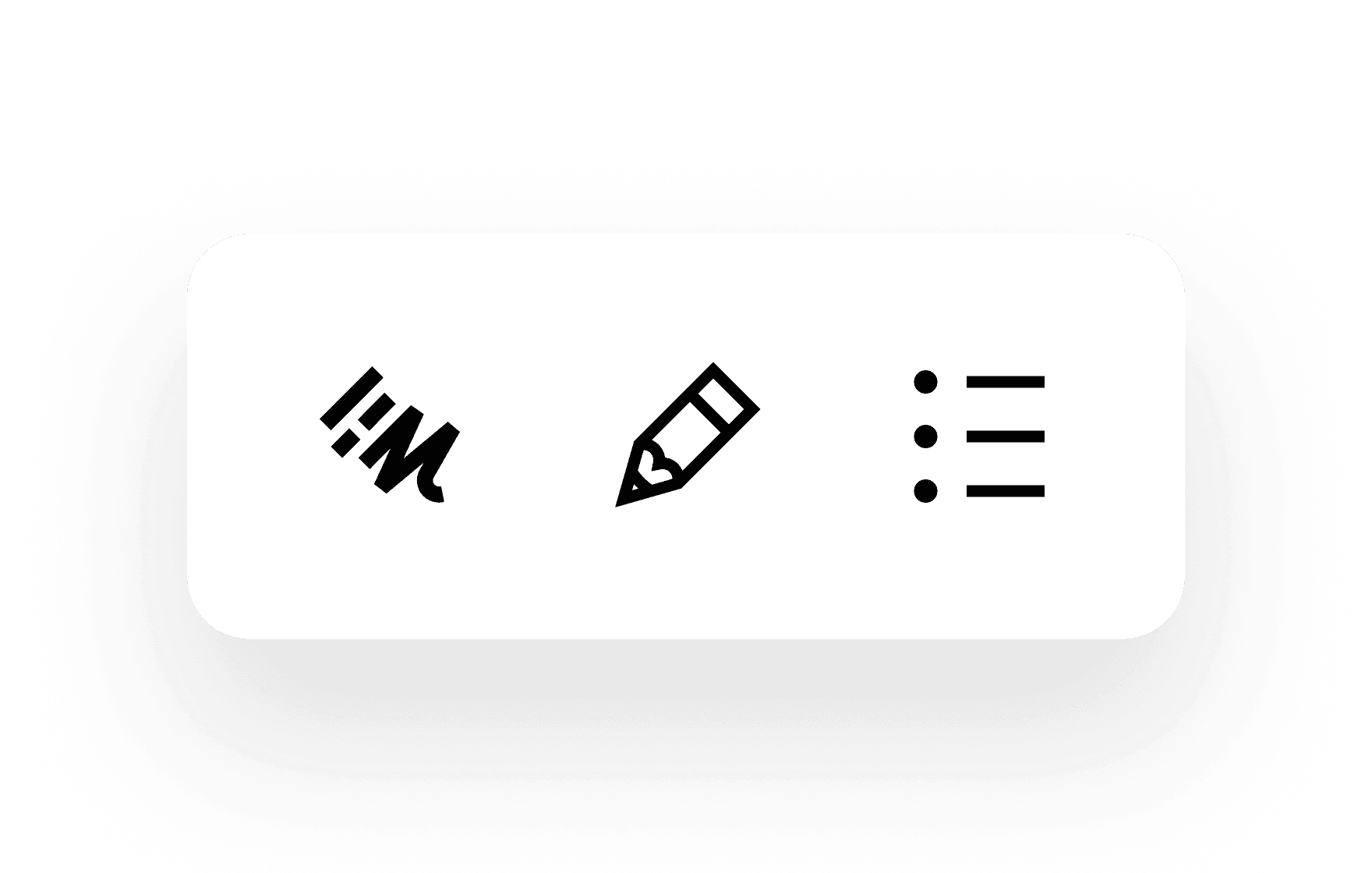
Trinil’s visual identity walks a fine line between structure and friendliness. Every icon is drawn on a 24×24px grid using a 1.5px stroke, with 2px margins to maintain breathing room. The design language is based on angular forms softened by subtle curves — a deliberate mix to avoid the extremes of current icon trends.
This balance creates a visual voice that works everywhere: structured enough for UIs, accessible enough for signage, neutral enough for branding.

Consistency through geometry and system thinking
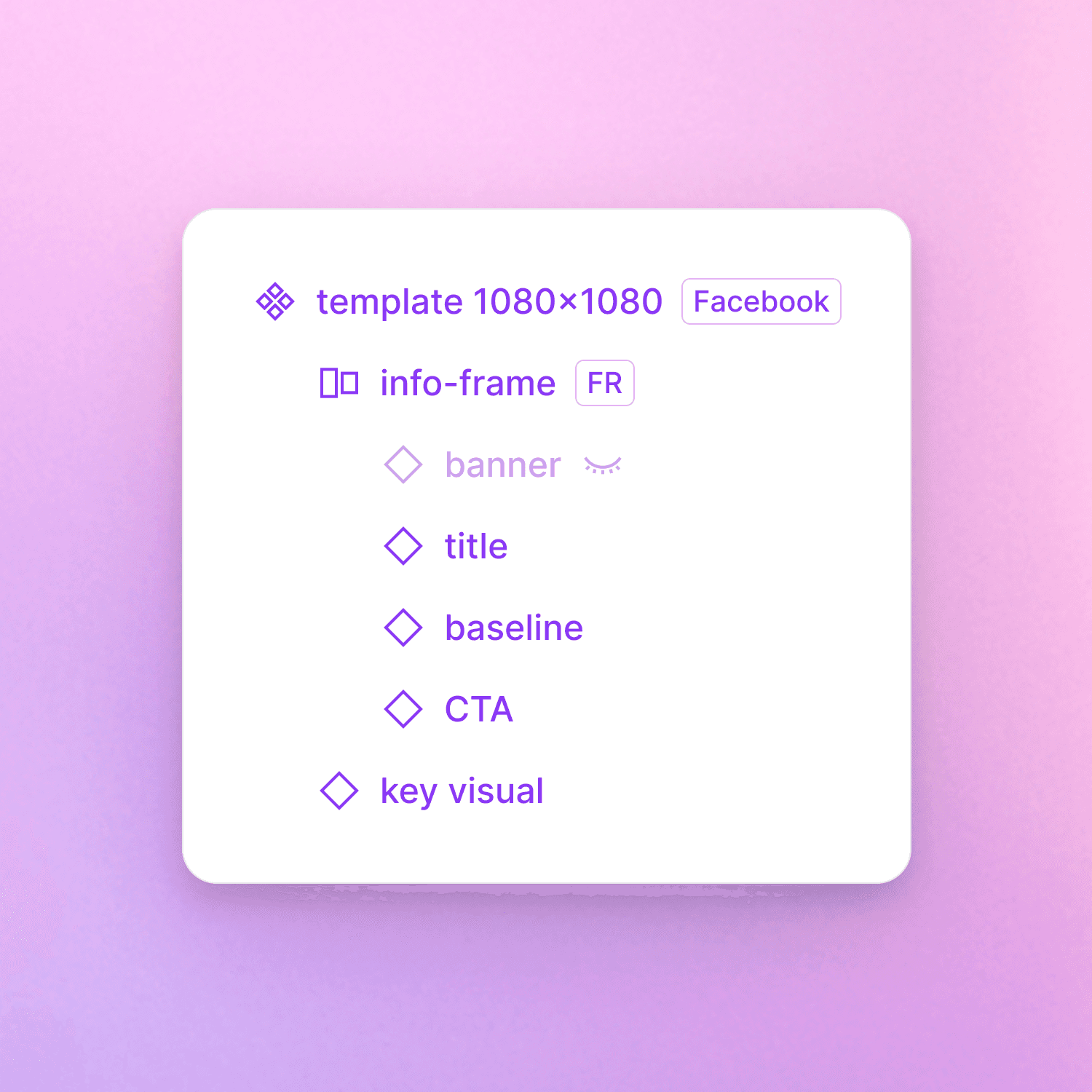
All icons are created using the same construction logic. I designed a reusable Figma template with visual alignment guides and snapping rules to ensure every icon is optically centered, balanced, and grid-aligned.
Each family follows a clear internal logic: arrows point the same way, shapes are proportionally scaled, and spacing is harmonized across contexts. Icons are named in simple, lowercase English terms, making the system easy to search, reference, and integrate into any design workflow.
Handcrafted, one by one
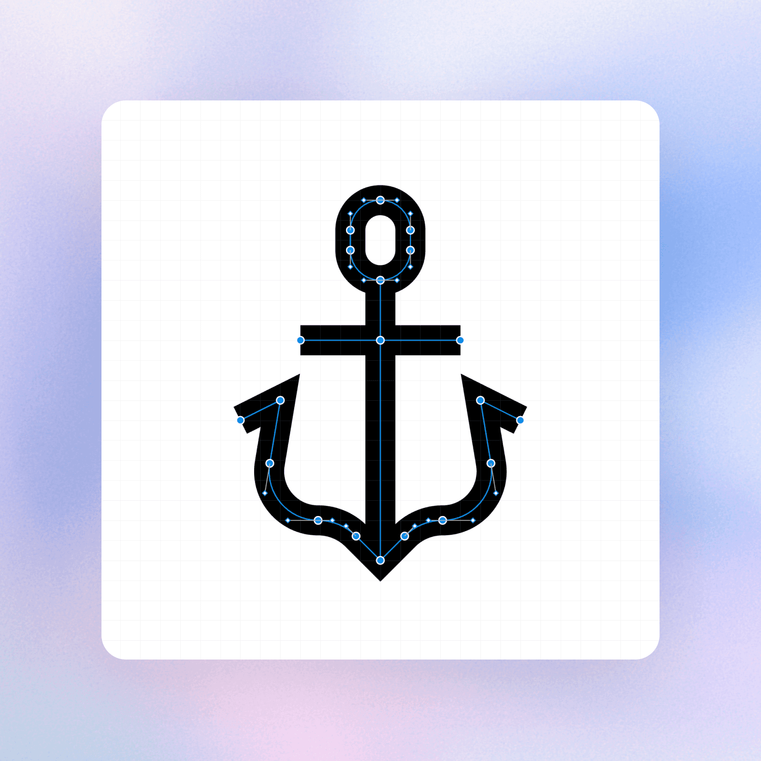
Unlike many icon sets built from primitive shapes or converted fonts, Trinil is entirely handcrafted using Figma’s pen tool. That choice was intentional: it gave me complete control over line rhythm, weight distribution, and visual harmony at small sizes.
No auto-tracing, no bulk generation — just a growing library of icons designed with patience and focus, like drawing letters in a typeface.
A visual voice that disappears on purpose
What makes Trinil unique isn’t its flamboyance — it’s the opposite. These icons are made to be invisible in the best sense: like a good typeface, they serve their purpose without drawing attention.
The slightly thicker 1.5px stroke improves readability across ages and screen types. Their style avoids overt personality, so they can blend naturally into any product — accessible by design, but visually neutral by intention.
Wide scope and open-source mindset, with designers and developers in mind
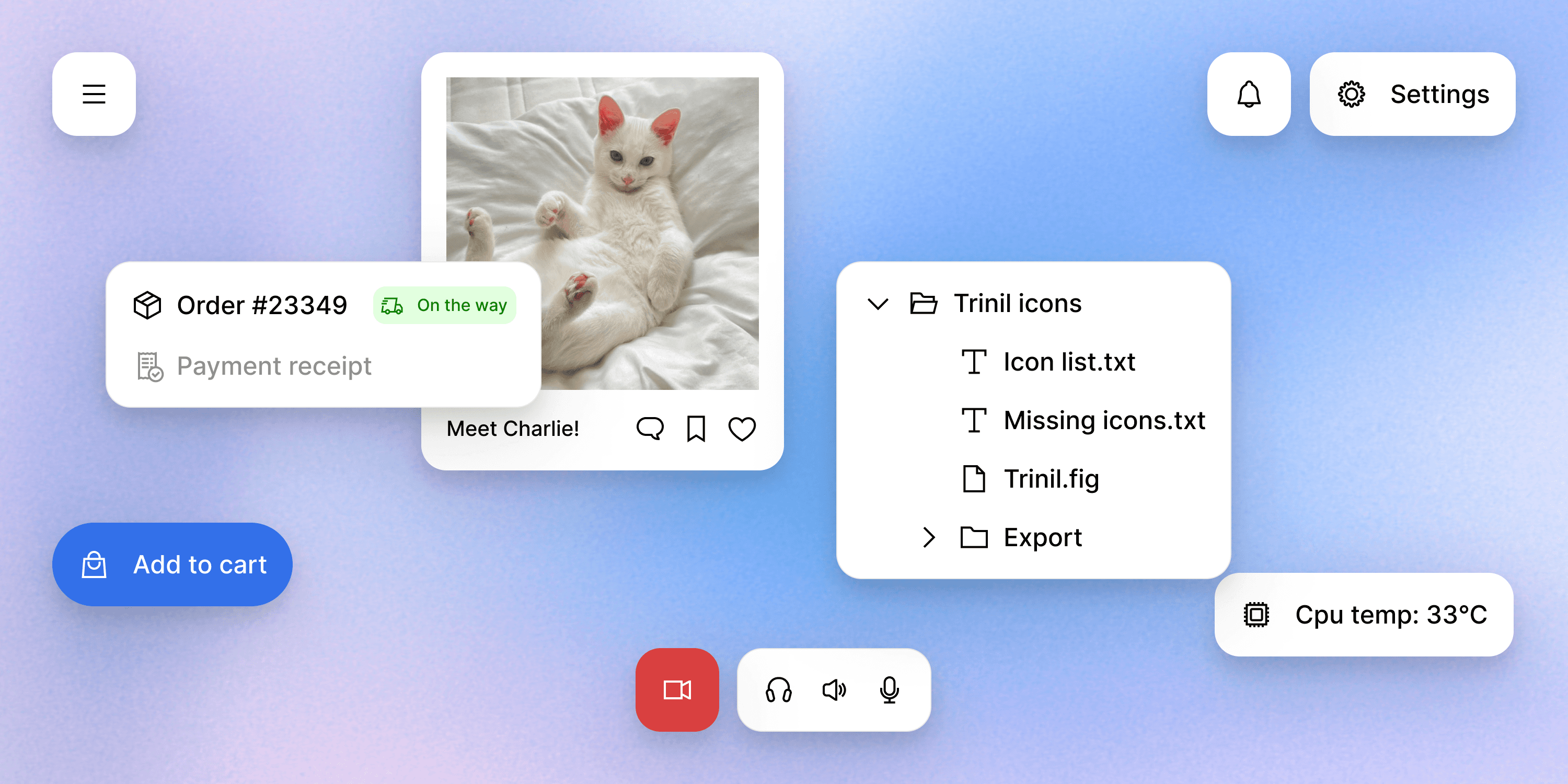
Trinil currently includes 539 icons divided into practical categories: Arrows, Interface, Files, Movement, Connectivity, Multimedia, Editing, Commerce, Users/Social, Time, Objects, Development, Nature, Medical. The system is designed to be expanded progressively, with the goal of covering the most common needs for UI, web, mobile, and product design.
When released, Trinil will be fully open-source. Inspired by systems like Lucide, Bootstrap Icons or Feather, the goal is to make Trinil easy to use, contribute to, and integrate.
The roadmap includes:
A GitHub repository with downloadable SVG files
A searchable Figma Community file
A clear contribution guide
Categorized exports and dev-friendly naming conventions
Everything will be freely available for designers, developers, and product teams.
Conclusion
This project is deeply personal. It combines my love of thoughtful systems, visual craft, and building tools that improve workflows. Trinil wasn’t created to stand out — it was created to help. If people use these icons and forget where they came from, I’ll consider that a success. Just like the best sans-serif typefaces, Trinil is meant to be felt, not noticed.
Trinil Icons is still in progress, but it’s already a meaningful part of my design journey. It taught me discipline, visual logic, and the beauty of building quietly useful things. The first public release is scheduled for late 2025, with over 1,000 icons, open formats, and full community access. Until then, I’ll keep drawing — one icon at a time.
2025
My part in this project: 99% of the icons were made by me
Special thanks to Mathilde, who helped me get ideas, and Hilary who designed 8 furniture icons on the 539. Special thanks too to Lucide icons, Iconoir, Heroicons, and Bootstrap icons for my inspiration.