Habitat.fr design system
After decades of bad e-commerce performance, Habitat.fr was bought by Vente-unique.com in 2024 with the goal of making the brand profitable again. As the only product designer of the whole Vente-unique team, I was missioned to create and maintain a design system on figma for the e-commerce website.

79
Components
57
Variables
8
Daily users
100%
Dev usage
A lot of problems to solve
Designing the new Habitat.fr design system wasn’t just about components, it was about solving deep-rooted issues in accessibility, clarity, and brand perception. The original visual language lacked structure, readability, and consistency.
I started by overhauling the accessibility of the UI, enhancing color contrast to meet WCAG standards, and redefining typographic scales, spacing, and rhythm to improve content hierarchy and information clarity.
To elevate the brand image, I introduced more sophisticated layouts, bringing a premium feel to the interface without compromising usability. I also redesigned interactive behaviors, adding refined hover states and scroll-based transitions to create a smoother, more modern experience.

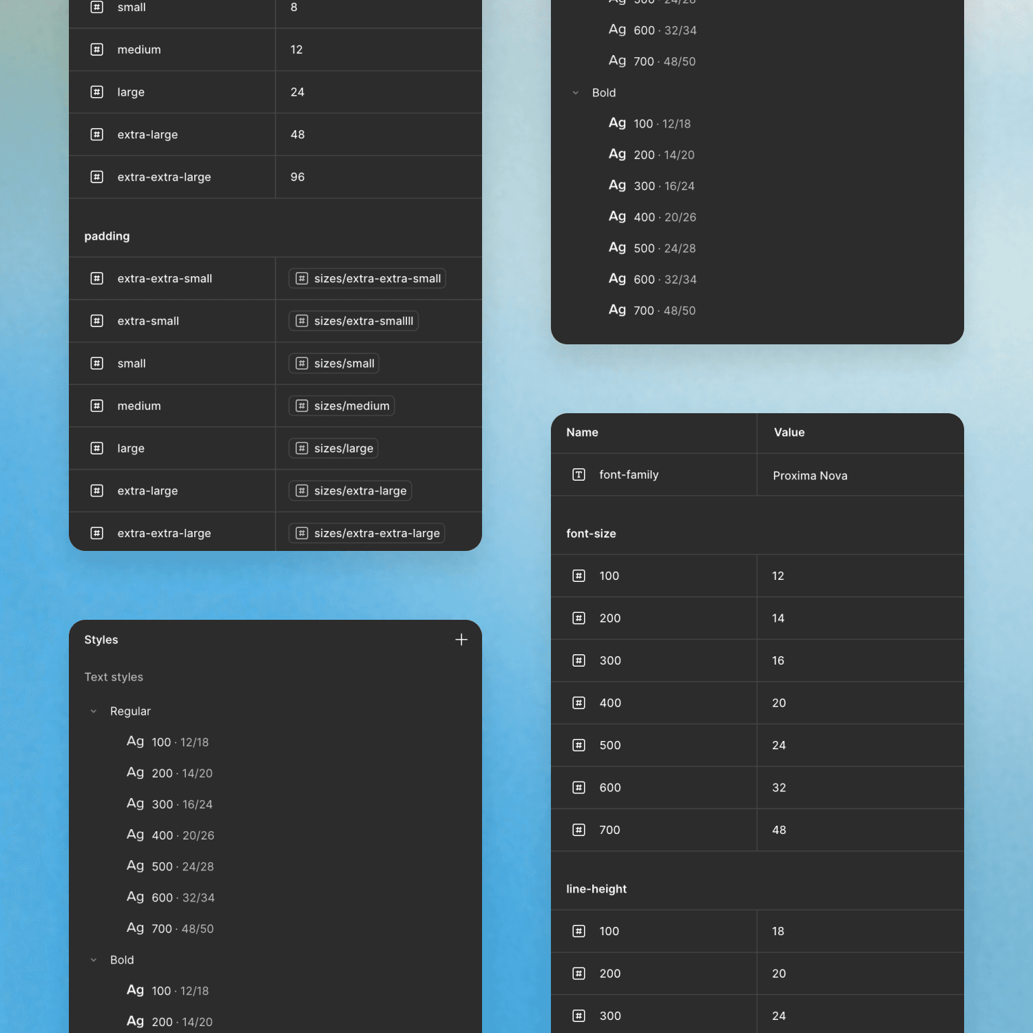
Typography & text styles
While font choices were defined by the brand’s art direction, I structured a clear typographic system with all headings available in semibold and regular for flexibility. Sizes are managed in pixels, and I adjusted line heights and text widths to ensure smooth reading.
Each style uses variables for consistency and easy maintenance. A key challenge was handling legacy coexistence during the gradual rollout, requiring careful attention to avoid visual clashes.

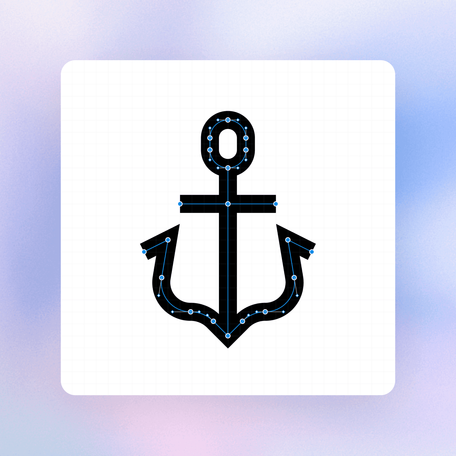
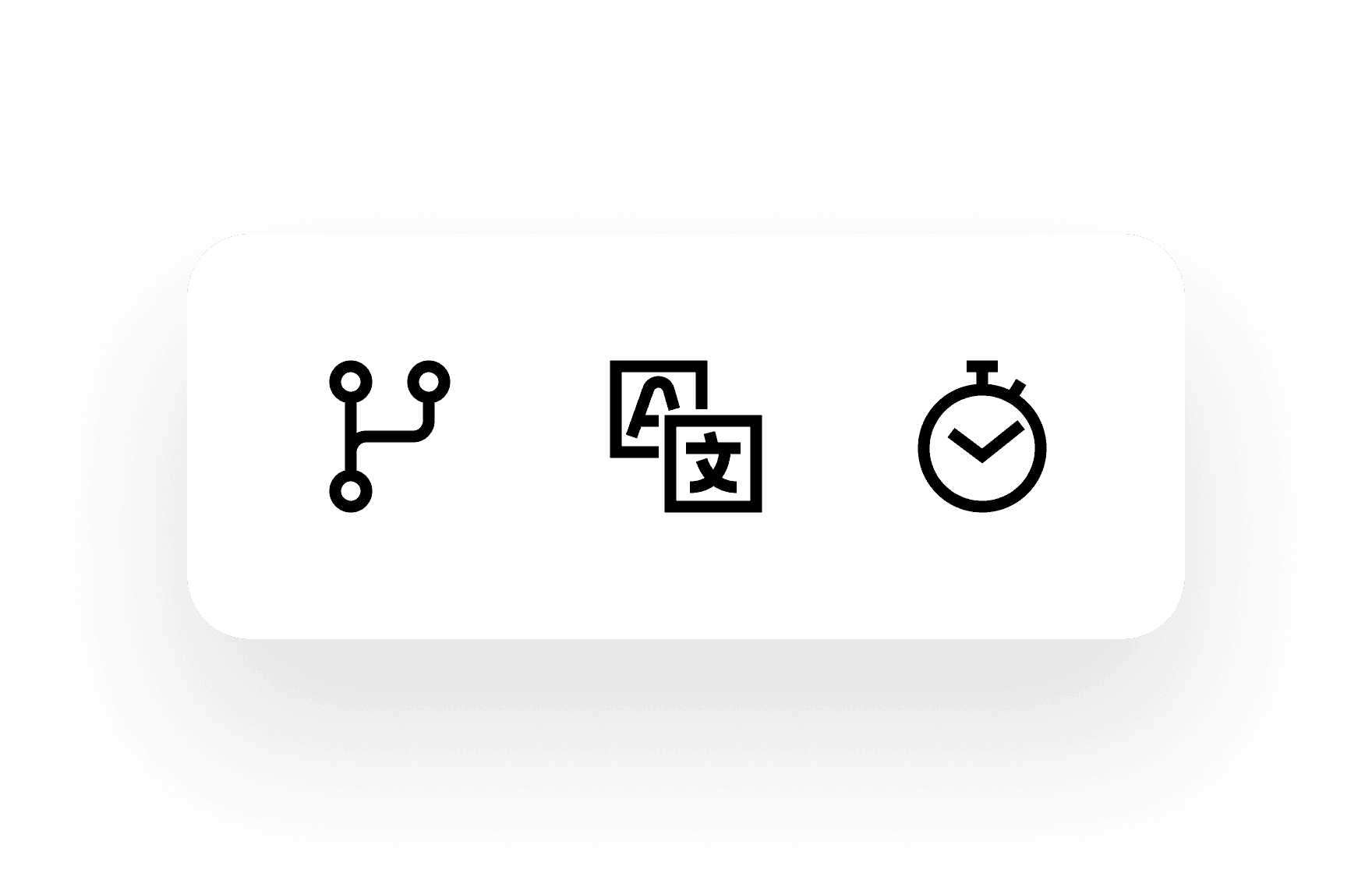
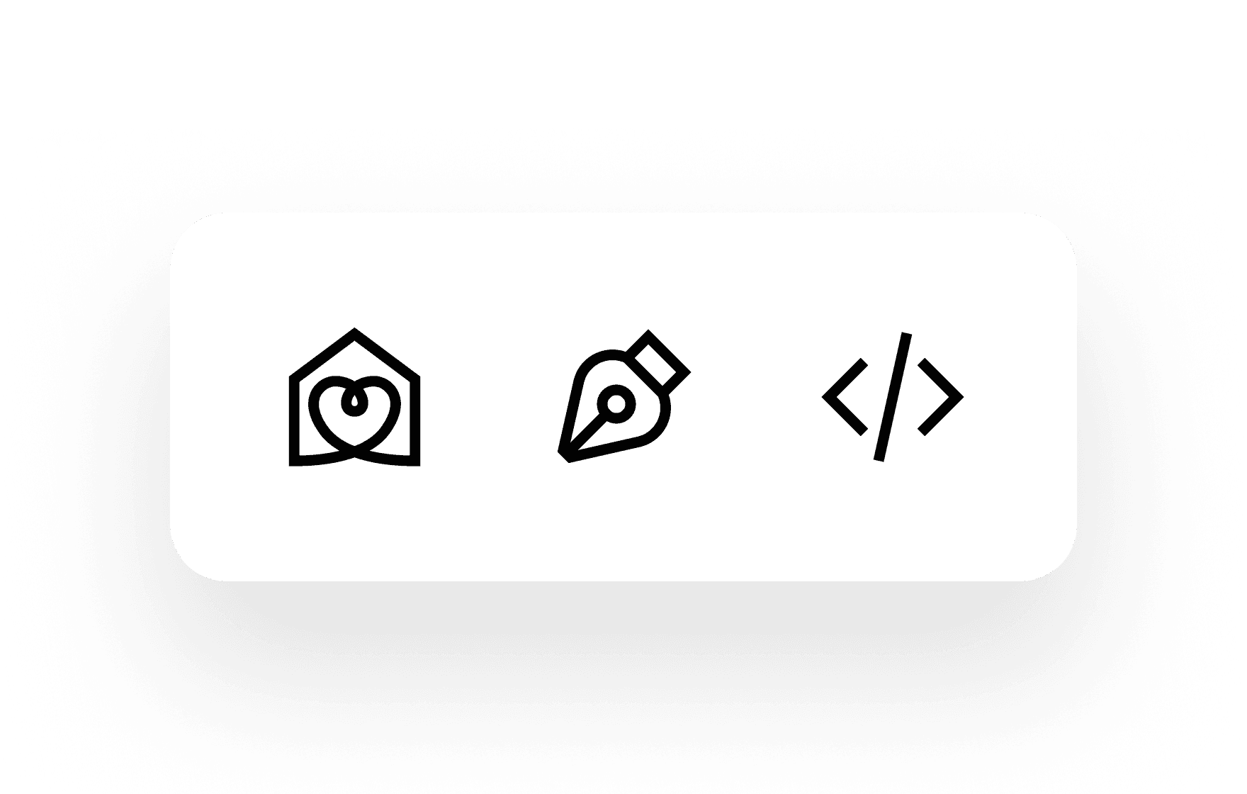
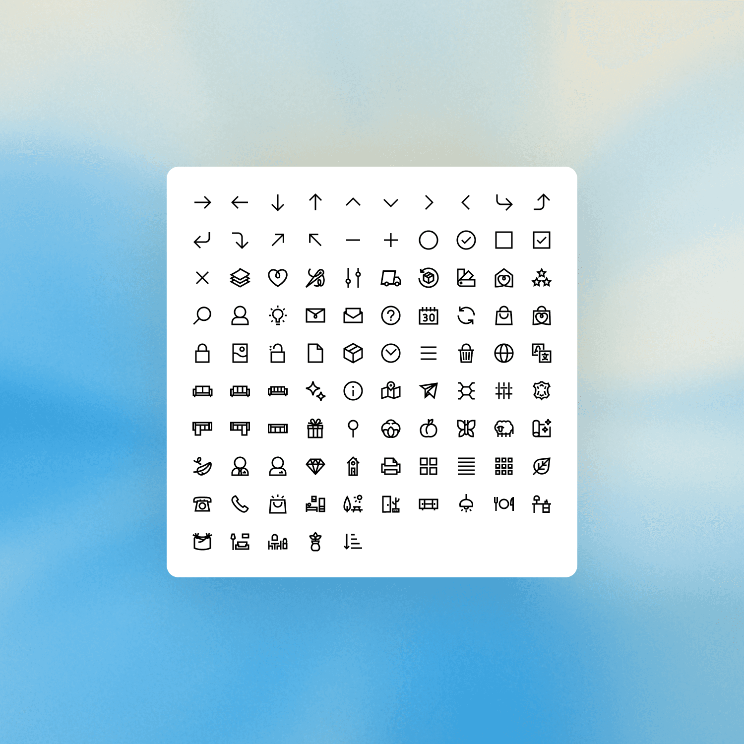
Icon system
I created a custom set of over 200 icons, drawn on a 24px grid with 1.5px strokes. The style is line-based, with right angles softened by rounded details, echoing the shape of the Habitat logo.
Designed entirely in-house, the icon set replaces a fragmented mix of old pictograms and brings visual consistency across the site. It’s optimized for clarity and accessibility, especially for older users, and includes Figma variables to control specs for development handoff.
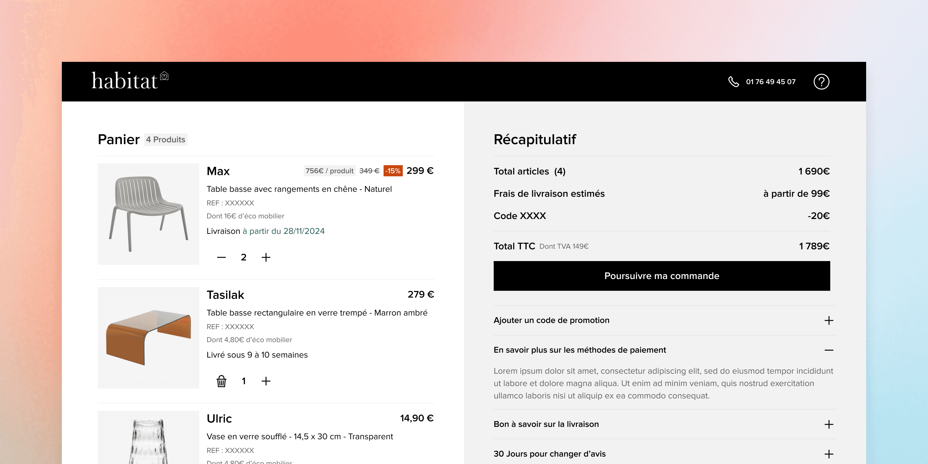
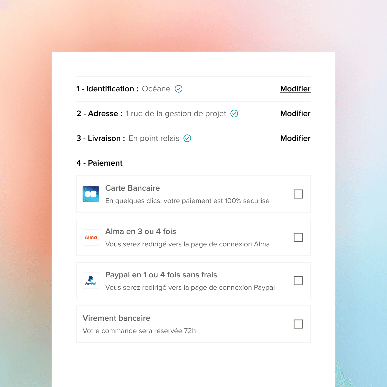
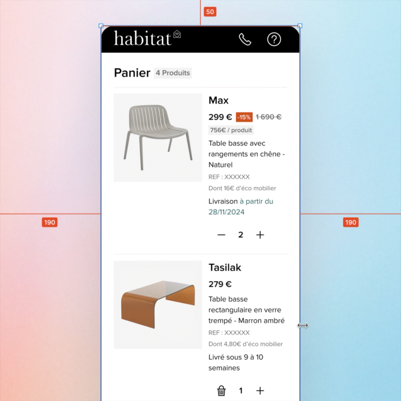
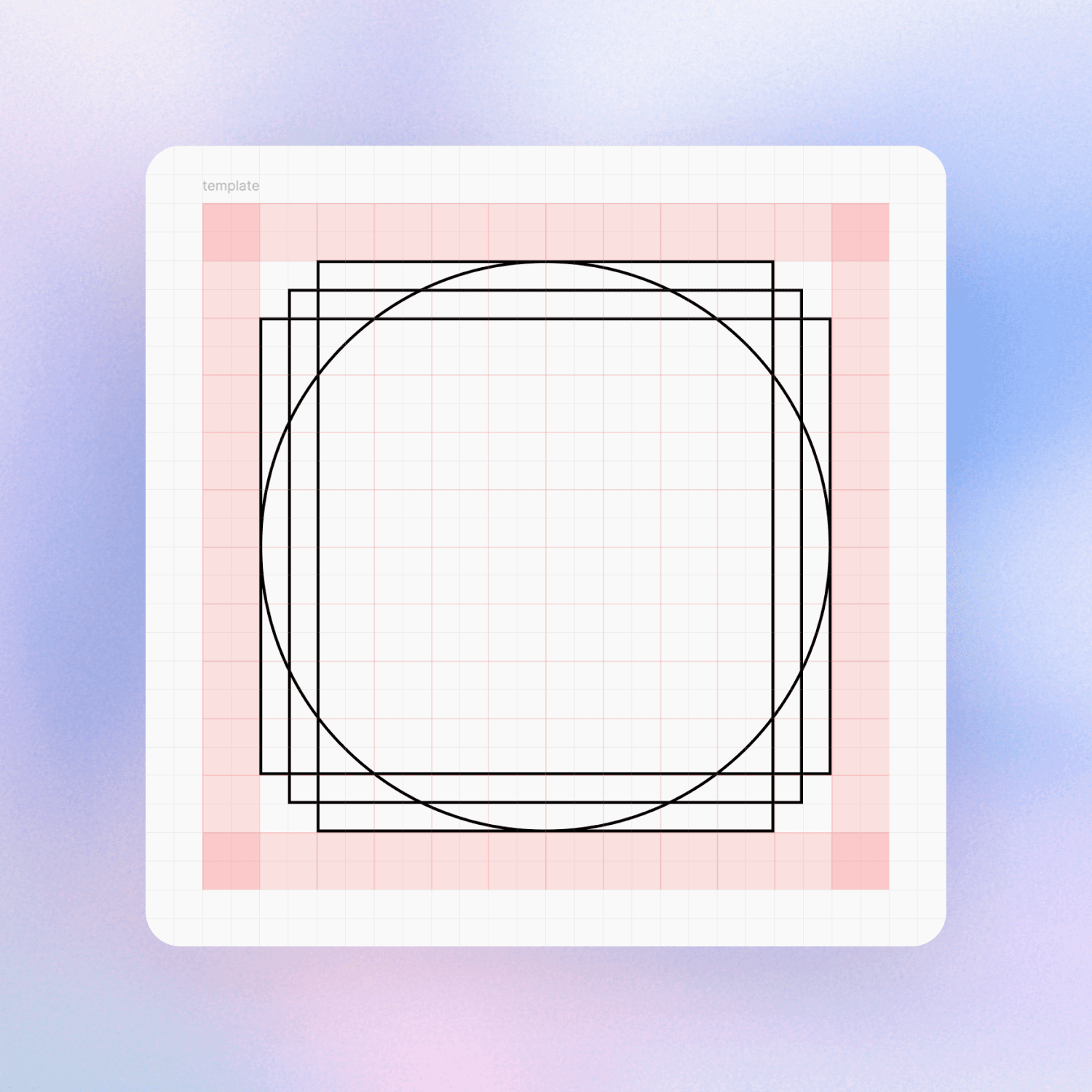
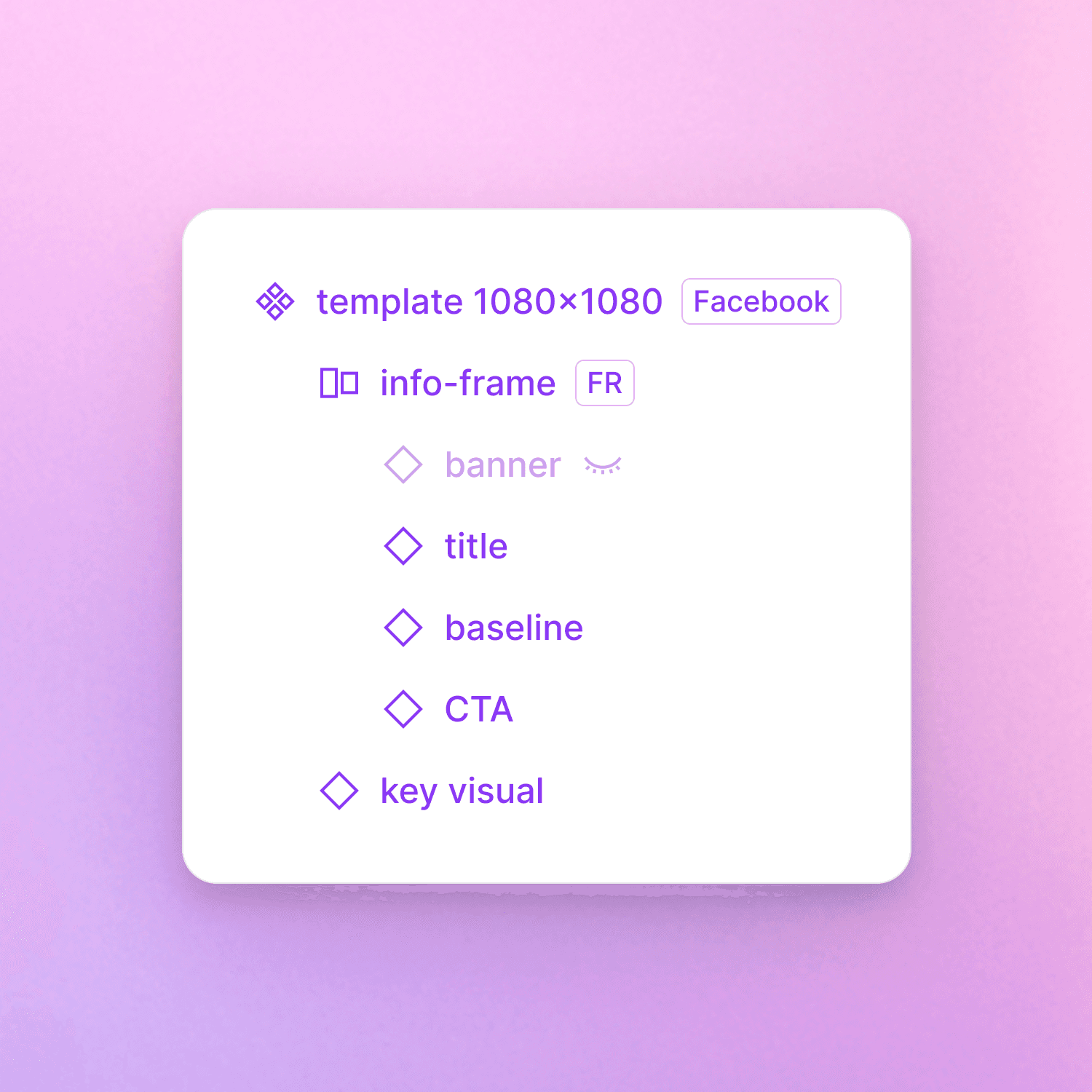
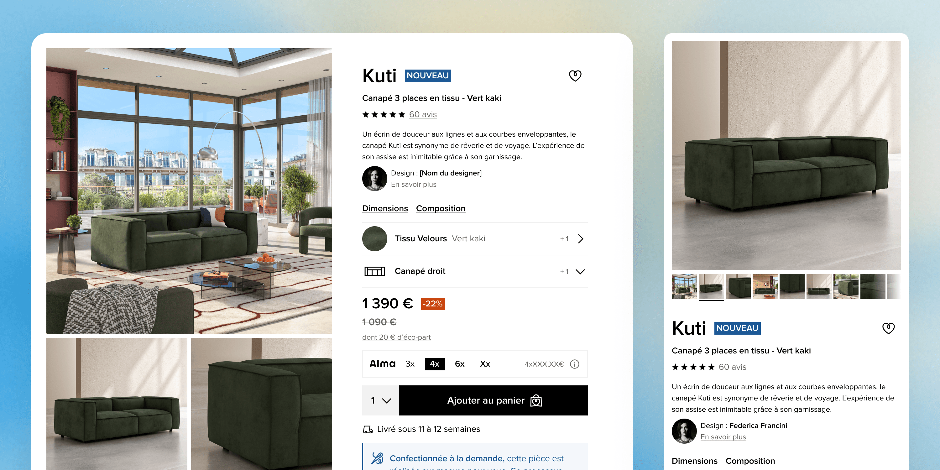
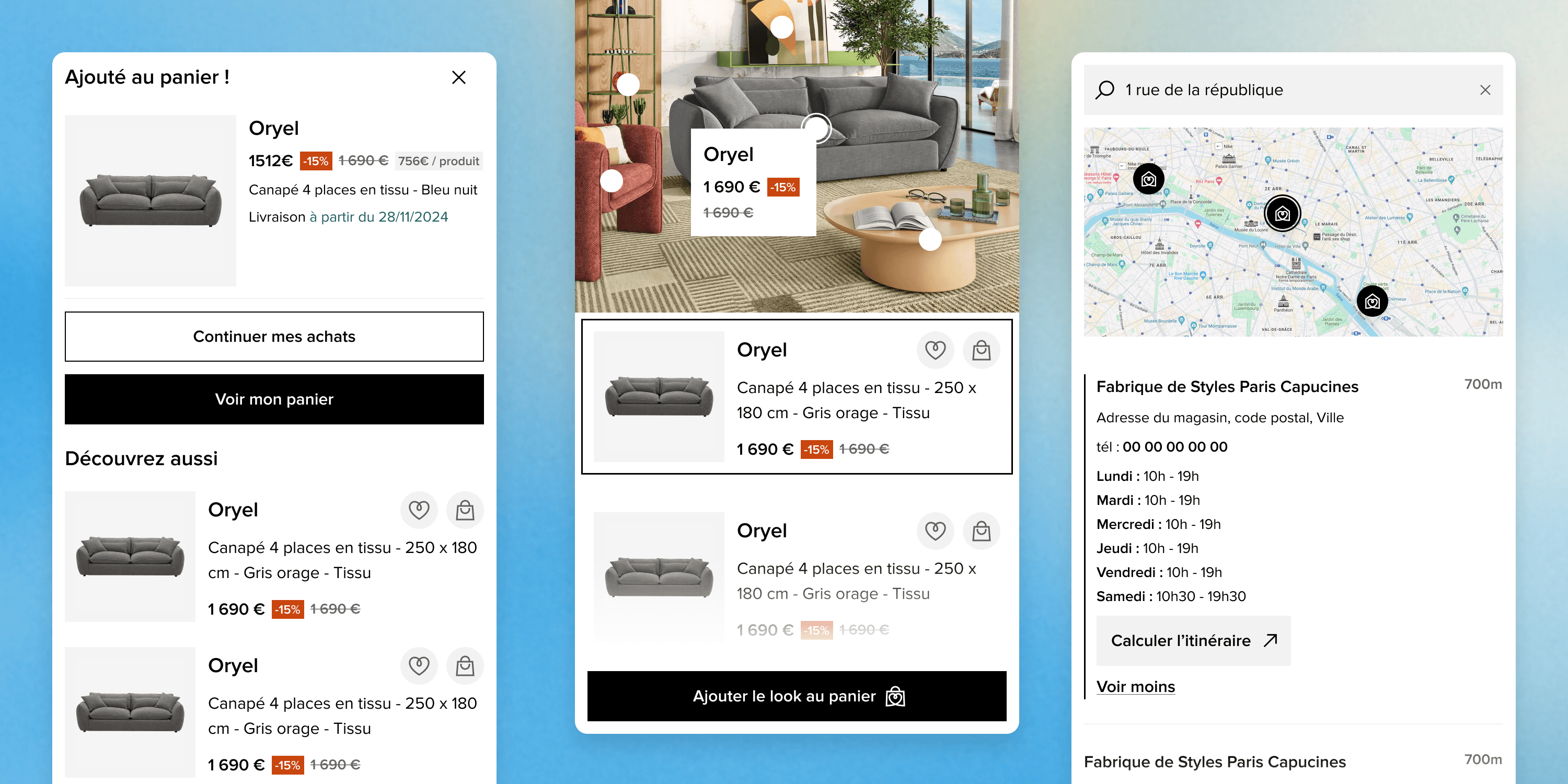
Product page redesign
The product page redesign was a key project that shaped most of the components in the design system. The legacy page was not responsive, lacked interaction, and suffered from poor visual hierarchy and outdated styling.
I led the UX and UI design fully, in close collaboration with the brand’s art director, developers, product owners, and department leads to align on feasibility, hierarchy, and content accuracy. The result included tabs, cards, dropdowns, banners, product info blocks, carousels, and more — all built as reusable components.
In total, I delivered 39 iterations across all viewports and interaction states. The goals were to improve clarity, perceived product value, and ultimately conversion. This new foundation set the tone for the entire design system.
Accessible colors
Starting from a very limited palette, I extended it into a scalable system adapted for web use. All colors were recalculated to meet WCAG AA standards, using contrast tools to ensure legibility across backgrounds, texts, and interface elements.
Rather than over-engineering a complex token system, I focused on clarity and maintainability, given the scale of the team. The previous color set lacked consistency and wasn’t accessible. This work brought the visual identity in line with accessibility standards, while reinforcing the brand’s direction.

Spacing system & variables
I defined a fixed spacing scale using familiar values: 3, 6, 12, 24, 32, 48, 72, 96, and so on. The system is implemented everywhere in the design, and each step is mapped to a variable in Figma to ensure consistency.
It replaces what was previously an unstructured approach and allowed perfect alignment with front-end development. The limited set of values helps both design and dev teams move faster, make cleaner decisions, and maintain a coherent visual rhythm across the system.
Scalability
The system was built with scalability in mind. Its structure allows for new components, layouts, and pages to be added with minimal effort, while keeping everything visually and functionally consistent.
An overall success
This design system has proven scalable and efficient. A few months after its release, I’ve designed more than 40 pages while only needing to add 2 or 3 new components. The system covers a wide range of use cases without requiring constant expansion.
It is now used by all front-end developers and the three product owners at Habitat.fr. Developers work directly from the Figma library and ask that all requests follow its structure.
Several reference documents were created to ensure consistency and facilitate collaboration. The system has helped speed up my workflow while improving the overall visual and functional quality of the site.
Although maintained by a single designer, it supports multiple teams and continues to adapt well to new needs, with minimal maintenance required.
2025
My part in this project: 100% of the designs, components, variables, colors, elements… Etc
Special thanks to Océane, Camille, Damien, Lucas, Coralie, Anthony, Aurélien, who helped me a lot on the development side, and project managment side of this project.